 Andy Crestodina (@crestodina), co-founder of Orbit Media and author of Content Chemistry, has a knack for giving digital marketing tips that make your brain happy. He’s either showing you how to set up Google Analytics reports to measure your website effectiveness or providing actionable marketing insights that makes you wonder, 'Why didn’t I think of that?'
Recently, I was lucky enough to see him speak twice in one week. First at Content Marketing World, presenting his Google Analytics expertise. Then a week later at a Cleveland American Marketing Association (@ClevelandAMA) luncheon discussing neuromarketing, which is the use of cognitive processes to persuade. The presentation (you can view his slides here) had many tips and tricks for your website, email and social content.
My biggest takeaways from this presentation were the marketing tips that you may not have heard before. However, they’re so obvious that you’ll kick yourself for not thinking of them.
1. The Testimonial Page Contradiction
Do you have a testimonial page on your website? That is the WORST place to put your testimonials. In general, testimonials are one of the least viewed pages on your site. While testimonials themselves are some of the most valuable social proof, you’ve got them on one of the least valuable pages on your site.
People don’t go to your site to read testimonials. Rather than put them all on one page, use the quotes throughout your site, and use them to help guide visitors through the buyer journey.
2. Subscription Sign-Up
Below are three P’s to greatly improve your subscription sign-up rate.
- Prominence: Make the sign-up box stand out. Consider a color that is contrasting to the rest of the webpage.
- Promise: Tell the viewer what they’ll be getting and when they’ll get it. And, be consistent!
- Proof: People tend to imitate behavior, so include how many people have already subscribed (i.e. Join the 10,000+ subscribers…).
3. Seeing Double
Want to double your sales? Show two of your product. Alka Seltzer shows two tablets in their ads and even incorporates it into their jingle, “Plop. Plop. Fizz. Fizz.” The campaign worked as it caused their existing customers to consume twice as much.
4. The Priming Effect
Especially with pricing, the first number people see tends to be their anchor to which they compare other prices. List the most expensive version of a product first, to make the other lower priced versions look more reasonable. Williams Sonoma lists their $380 bread maker right before the $235 version. The $235 version is their top seller (even over the $159 version).
5. The Pain of Loss > The Pleasure of Gain
People feel more pain when they lose something than the pleasure they feel when experiencing a gain. A real world example is with Barnes and Noble. When a customer asks where to find a book, their employees don’t just walk them over to it. They actually place the book in their hands. This triggers ownership in the customers’ minds and makes it harder to put the book down.
6. Further Relationships by Crossing Streams
One way to further your relationship is by “crossing streams.” This is a tip Crestodina offers: If someone likes or shares your content on one platform, thank them on another. So, if someone shares your content on Facebook, thank him or her on LinkedIn. It pulls your relationship into new platforms and deepens your ties.
7. List Order Matters
We all know people like lists. That’s why you see list blog posts everywhere. They get clicked and read. You’re reading one right now! But, did you know that the order of the list matters?
People have higher attention and retention for items at the beginning and end of lists. Put your most important ideas first, and the second most important last. The least important information should go in the middle.
8. Call-To-Action Button
Similar to the note about using contrasting colors for subscription sign-up boxes, the same holds true for call-to-action (CTA) button. If your webpage is mainly made up of cool colors, then use a warm color for the CTA. Our eyes are drawn to the area that is different from the rest of the page.
9. The Giant Exit Sign
Be careful with social media sharing buttons and other external links featured prominently on your website. While we want people to follow us on these sites, we don’t want them to leave our site. Crestodina compared it to a department store with a huge exit sign as its only signage. While that wouldn’t make sense, we do it all the time on websites.
10. Follow the Eyes
Studies show that we are drawn into looking at faces or objects that resemble faces. Not only that, we follow the eyes to where the person in the photo is looking. Place your offer or CTA in their eye line.
What tips have you implemented that have shown quick impacts to your marketing? Tell us in the comments below.
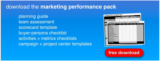
Want even more tips and resources to improve your performance today? Download the Marketing Performance Pack, our free toolkit that's designed to help you improve your marketing.

%20Logo_BlueOrange_Trademark.png?width=800&height=269&name=Ready%20North%20(RN)%20Logo_BlueOrange_Trademark.png)


.jpg?width=300&name=Services%20Hub%203%20(3).jpg)


