 Why do visitors come to your website? And what do they want when they get there? The answer to these questions should be the heart of website design.
It’s easy to get caught up in visuals, such as the interactive elements that can make you feel like your website is living in 2118 when everyone else’s is in 2023.
But when it comes down to it, your website simply needs to be updated, functional, and easy to navigate. In fact, about 85% of web designers believe crowded web design is the most common mistake made by small businesses, and 42% of people will leave a website because of poor functionality.
This following post encourages you to think about the big picture when it comes to your website, how to get to the heart of what your website’s purpose is, and how it can streamline the website user experience.
1. Invert Your Thinking
One key difference between your marketing team and your site visitors—you know more about your business than them. During the website strategy and design process, pages may be organized, added, and removed according to your business’s perception of its own products and services because your team is in charge of it.
The key is to invert your thinking, to focus on your visitors. In the end, make it easy for customers to self-qualify themselves according to their need.

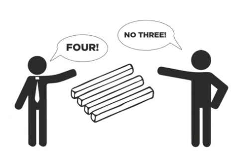
Photo credit: Facts Verse
Consider walking into a shoe store. There are thousands of ways shoes could be organized, but most stores arrange them in the same, customer-centric way—men’s, women’s, and kid’s. The men’s section is then segmented by running, basketball, dress shoes, and so on.
Now imagine if a shoe store organized it in the way their business thinks about shoes. The shoes may be organized by release year or based on the style your team is most excited about at the time. But, this business-centric setup would leave potential customers confused.
Assuming you don’t sell shoes, odds are your potential customers know less about your business and services than they do about shoes, so present your site to visitors in a way that focuses on customer needs and their understanding of your offerings.
Think: Is your website organized in a way that visitors will most understand so they will easily find what they need?
2. Simplify
Have you ever been to In-N-Out Burger?
Though a Clevelander, I’ve been fortunate enough to venture to the West Coast to dine at one of these restaurants named one of the “10 Most Craveable Burger Chains” by Restaurant Business.
The In-N-Out menu has three meal choices. That’s it.
The truth is, options sound great in theory, but too many choices can cause some unwelcome emotions. In fact, too many options:
- Leads to greater regret
- Can cause us to make bad decisions
- Can lead to paralysis of action
- Leaves less time to make the right decision
Making website visitors feel any of these emotions, even for a split second, can be detrimental to the site’s goals. Is your website giving visitors too many options at a time?
An important trend in website navigation is to remove drop-down options where possible to ease visitor decision-making. Usability studies confirm this!
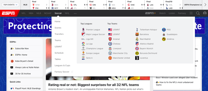
Consider ESPN.com, for example. The site has around 10 choices in the main navigation, each with a drop-down menu, many with dozens of additional options.

Photo credit: ESPN
It may work for a sports site. But, the premise of having 100+ options in the navigation bar is overwhelming.
Think of your website like an elevator pitch. The visitor doesn’t need to know your whole story in one sitting, just what matters to them at that point. If they want to learn more, they’ll ask questions (i.e. click on the items relevant to them) to learn more.
3. Think Mobile
According to Statista, mobile accounts for about half of web traffic worldwide. That trend is unlikely to stop. Mobile site design requires a new strategy, including varied design and functionality.
So, what is different about mobile site visitors?
They are less patient than desktop visitors. Smartphone users are often on the go, likely choosing between your website and 25 different apps at a time. Building upon the “simplify” premise is of heightened importance on mobile. Strip out “nice-to-have” options and features and highlight only the most relevant pages.
For mobile, site speed is also critical. Phones need to establish a radio connection before even loading your website, inevitably increasing the time users are left waiting. A couple tips:
- Optimize images. Use an image compressor like TinyPNG or Compressor.io to reduce image file sizes without losing any visible quality.
- Replace your cool hero video with an image on mobile. BMW.com shows stunning videos throughout the homepage on desktop but replaces those with still images on mobile.
- Get technical. Remove unnecessary code, eliminate unused plugins, cut down on redirects, install a CDN, and install a caching plugin.
Find out how strong your website is, including its overall speed, using our Website Grader.
>>> For technical advice on improving your mobile site speed, check out Neil Patel’s article, How to make Your Mobile Site Load Faster.
Upgrade Your Site's UX With Content That Resonates
Take your UX a step further with a content strategy that resonates with your target audience and search engines. Discover how in our on-demand webinar below, How Content Strategy Can Enhance UX During And After a Website Redesign.


%20Logo_BlueOrange_Trademark.png?width=800&height=269&name=Ready%20North%20(RN)%20Logo_BlueOrange_Trademark.png)


.jpg?width=300&name=Services%20Hub%203%20(3).jpg)

