 Below is a guest post by John Wieber (@johnwieber). John is Partner at WebMoves. He has 13+ years experience in web development, ecommerce, and internet marketing. He has been actively involved in the internet marketing efforts of more then 100 websites in some of the most competitive industries online. You can reach John on Twitter (@webmoves_net), LinkedIn or Google+.
Nearly 60 percent of total digital media time is now mobile. From commerce to content to social media, your target audience is more likely to be searching for brands from a mobile device. If your brand hasn’t gone mobile, it’s probably missing out on a lot of potential revenue.
Note: Google is also sending warnings to webmasters who have websites that are not mobile-friendly, which indicates that it will likely be launching a mobile-ranking algorithm in the near future.
Have you been slacking on mobilizing your brand? It’s not too late to start. Mobile branding has three major factors: your own responsive website, use of mobile map listings, and use of review sites.
Step 1: Responsive Design
Charity starts at home and so does mobility—Your home page, to be exact. Your website design is a huge determining factor in whether your brand is ready for mobile users. Search engines have made it clear that they prefer to index one site for both mobile and desktop users rather than having separate ones. That’s where responsive design comes in.
Responsive design is essentially the idea that your website will fit the screen of the device it’s viewed upon. As the screen size gets smaller, design elements take on a more vertical approach. Instead of narrowing the elements, a responsive design will stack the elements. Elements sizes are no longer thought of as pixels but as percentage of screen size. An 800-pixel image retains its size on all screens but a 100 percentage image retains the percentage of screen width on each screen.
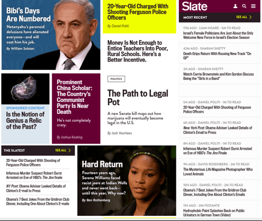
Above: Slate Magazine on Desktop
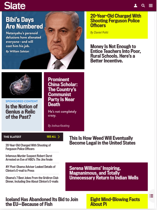
Above: Slate Magazine on iPad
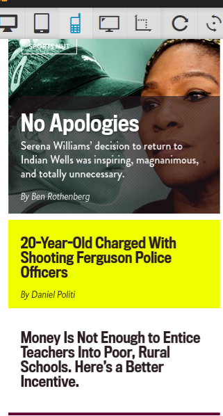
Above: Slate Magazine on iPhone
While mobile traffic is growing, some designers are still designing for desktop users first. They start with an overall design theme with bells and whistles, and then pare down for mobile users. Consider doing just the opposite, though. Mobile users are more circumspect in what they are looking for and usually only need the bare essentials. If you start your design with the bare minimum your target audience is looking for and then add bells and whistles sparingly, you’ll end up with a more direct design.
Step 2: Mobile Map Listings
Map apps are a huge part of mobile search. Google, Apple and Microsoft all make proprietary mobile map applications for their mobile operating systems, and there are also a host of third-party apps. Yelp, Facebook and FourSquare all have popular mobile map listing apps.
Each of these applications have listings where a brand can input information, share photos and offer discounts. These are invaluable for any business where a potential customer might need to find listings on the go or might be more concerned about what’s nearby than a name they already know. In particular, restaurants, gas stations and any type of service-oriented business should be taking advantage of these listings.
Remember that Google and Microsoft use these listings to feed their search engine results. Yelp and Facebook business listings also rank highly in search engine results. By utilizing these listings, you are giving yourself a little more push in the SEO department as well.
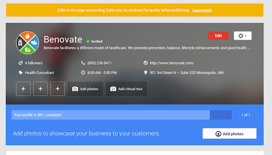
With these listings, the more information provided, the better. Start with providing all relevant information, such as hours of operation, address and phone number. Anytime there is a change to these piece of information, don’t forget to update your listing. There is nothing more frustrating than finding that a brand’s online listing is out of date.
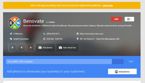
Include images in any listing your create. Not only should you add your logo, but also there should be pictures of your products or services. Images of your location and staff can also be helpful. Professional pictures are preferred, but any picture you associate with these listings should be one you wouldn’t mind representing your business.
Choose any keywords relevant to your business. Keep in mind that these will be used when users are searching through the listings. Consider your industry, your product or service, your location and your target audience. If you’re a 24-hour plumbing company that services the San Fernando Valley, “plumbing,” “24-hour,” “San Fernando Valley” and “busted pipes” might all be used as valuable keywords.
Step 3: Review Sites
Review sites and apps are often connected to mobile map apps because there is some crossover between the two in the industry. Many map apps allow users to leave reviews, and many review apps will give directions to the businesses. But reviews can also be a completely different animal in that you are dealing with user-generated content that you don’t usually have much control over.
Some apps allow you to buy memberships that give you some control over the way your review content is displayed. You can choose to have your best reviews shown first in the default sort, for example. If you claim your business account, you can also dispute any untrue reviews, and you can publically respond to reviews that you feel are unfair.
But you can’t control who writes reviews on these apps. The best way to influence is to inspire positive reviews. Unfortunately, you can’t do that by buying or soliciting reviews. Doing so can get you banned or flagged.
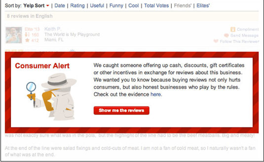
The best way to control your listings on review apps is to encourage positive reviews. Remind customers that you are on review apps on your marketing collateral and correspondence. Yelp in particular offers a window sticker that says “Check us out on Yelp.”
Finally, call attention to positive reviews by posting them in your business and calling attention to them on your own website. Some restaurants post them near the registers or in the bathrooms, along with a QR code instructing customers to find more positive reviews online.
Like this? Subscribe to the PR 20/20 Blog!
Image Sources: Slate, Google+, Yelp

%20Logo_BlueOrange_Trademark.png?width=800&height=269&name=Ready%20North%20(RN)%20Logo_BlueOrange_Trademark.png)


.jpg?width=300&name=Services%20Hub%203%20(3).jpg)

COMMENTS