Last year, it became increasingly evident that we had outgrown our existing website.
Between 2016 and 2019, PR 20/20 had evolved so much that the website was no longer a strong reflection of our vision. A critical piece of business growth, the website was no longer serving its purpose as the metaphorical “front door” to the agency.
In 2016, we launched the Marketing AI Institute: a content hub that explores the current and future potential of AI, machine learning, deep learning, and cognitive computing to transform marketing. The move transformed the direction of our services at PR 20/20. In fact, our team’s AI knowledge permeated all aspects of the business—inspiring us to launch beta products in our suite of Intelligent Automation Solutions.
But amidst all of this change, a few key convictions remained the same: We still believe HubSpot is the backbone of a closed-loop digital marketing program. And, like our tagline says, PR 20/20 continues to Look Beyond what’s possible through our three marketing pillars: strategy and performance, technology, and storytelling.
>> For more on our storied history with HubSpot, check out this post on Why We Bet on HubSpot Six [Now 13!] Years Ago ... And Why You Should Now
So, with all of this in mind, we decided to reimagine the agency’s website with new positioning. Now that it’s live—because yes, you’re looking at it!—we wanted to share our process to make a website project a bit more approachable.
Website Rethink: Our 5-Step Approach
Before getting started, we referred back to the Growth-Driven Design Methodology. We’ve been big fans for quite some time, and we wholeheartedly agree that “traditional web design is broken.”
“The Growth-Driven Design Methodology combines Lean and Agile principles into a highly effective data-driven web design process.”
I’d suggest checking out the website or HubSpot’s Growth Driven Design FREE course for a deeper dive.
With the Growth-Driven Design approach in mind, we built a five-step process to launch a website that more accurately tells our story.
Below I’ve overviewed the five main steps we took (along with the subtasks in each), and what we discovered along the way.
Disclaimer: This is a super high-level look at what went into the new site’s development. There were quite a few smaller items addressed along the way.
1. Discovery
We kicked off by developing an audit of the current site to benchmark performance and better understand what wasn’t working (and what was). This document turned out to be a beast; it included a deep dive into the website grade, a Google Analytics assessment, an audit of competitor websites, and a content and SEO assessment.
Next, with a firm grasp on current performance, the team developed a Creative Brief. We used this exercise to define our new messaging—zeroing in on how we wanted to communicate an evolving story through the new website.
Below, check out our new mission and vision statements.
PR 20/20 Mission: We help our clients grow. We fuel growth today with HubSpot, and we're prepared to fuel future growth with marketing AI technology.
PR 20/20 Vision: We look beyond, and we believe the future is more intelligent and more human.
This mission and vision became the bedrock upon which we built content strategy, design objectives, brand standards, imagery, and drafted a new sitemap. With a clear story to tell, the design vision fell more easily into place.
Tip: The more time you spend in this phase, the more aligned your website will be with organizational culture and goals.
2. Design
Our new sitemap was designed to be much simpler than our existing site, which had six main tabs in navigation—each with corresponding dropdown menus. With so many options, the buyer's journey became muddled. There was no clear path to conversion, and ultimately, it wasn’t a great user experience.
The new sitemap showed only five options in main navigation (Clients, Solutions, Resources, About, plus a search bar), with a more extensive list of links in the site’s footer. We also eliminated drop downs in the header’s navigation, and added more calls-to-action and a more strategic internal linking structure. What resulted is a much more intuitive user experience that guides users seamlessly from one page to the next.
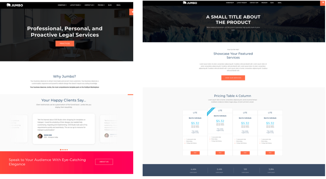
With leadership’s buy-in on the sitemap, we examined a shortlist of templates from HubSpot’s Asset Marketplace. The template we selected (Jumbo) aligned with our design concept and needs for differing types of internal pages.
During this phase, the team created design mockups (in Keynote) for different types of pages—like main navigation pages, offer pages, landing pages, and the blog. These served as guides to design templates for each and customize the Jumbo pages to align with our style guide (think colors and fonts). Creating templates first makes it easy for other team members who aren’t as savvy in HubSpot’s Design Manager to jump in and create pages with ease. Check out a few sample mockups below.

Finally, we were ready to write!
Tip: The HubSpot Asset Marketplace takes the development out of web development. You can purchase full template packs with all the internal page types that you’ll need to build.
3. Content and Optimization
Between the Creative Brief and the new sitemap, the team was 100% aligned on how to tell our new story. Because of this, we were able to divvy out and assign high priority pages to internal team members. We started with main navigation, and waterfalled all production from there.
Tip: Ensure writers are armed with page layout details before diving in. The content structure must follow the page design to create a simple upload process.
Note that every page drafted underwent a series of internal reviews to make sure our messaging is delivered consistently. While design is crucial to communicate your message, the storytelling is what we really needed to nail this time around.
4. Quality Assurance
After drafting pages of new site copy (and leveraging the copy that we could repurpose), we created each unique optimized page in HubSpot CMS and organized all pages according to the sitemap.
Tip: Ensure you add 301 redirects for all old pages that won’t be featured on the new site.
Once all pages were designed and optimized, the team conducted a thorough quality assurance review. We had the full leadership team review and test the website and flag any issues in a shared Google Drive document. Don’t forget to test your new site on mobile too (a native feature on the HubSpot CMS)!
5. Launch
We decided to take the soft launch approach. The site wasn’t perfect upon launch (and it’s still a work in progress), but it included the most important items on our preliminary wishlist.
Following the Growth Driven Design Methodology, we treated our new site like a Launch Pad. The Growth Driven Design site states: “The goal of the Launch Pad website is to quickly build a website that looks and performs better than what you have today, but is not your final product. Your Launch Pad is the foundation from which you collect real-user data and optimize.”
Using this mental model made the launch a LOT less intimidating.
Since March’s launch, we’ve already expanded the site and made changes based on initial user data. Plus, we’ve already seen an uptick in traffic. In fact, as compared to last year, May’s sessions improved by 21%.
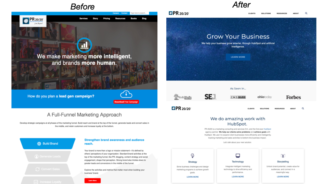
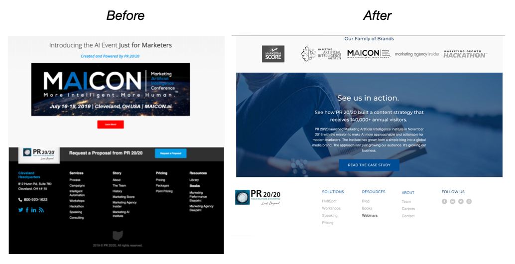
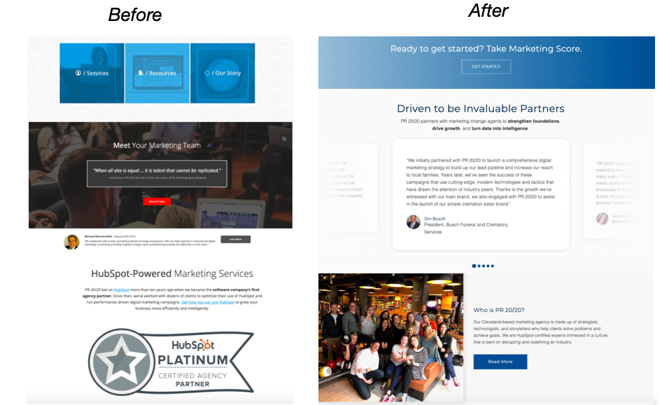
Equally important, we’ve gotten a lot of positive feedback from clients and prospects alike. Take a look at a few before and after snapshots below.
Before and After the Website Reboot
Below, we’ve included a look at the homepage as you scroll, before and after the website’s overhaul.
Note that the new site gets right to the point with a new header that says, “We help your business grow smarter, with HubSpot and artificial intelligence.” Our messaging is more specialized because we’ve become more specialized as an agency.


Are You Ready to Rethink Your Website?
We are proud of a final product that better reflects our new mission and vision.
Are you thinking about following our five-step approach? Contact us and we can discuss how we can help. Or, check out our Solutions page for additional service details.

%20Logo_BlueOrange_Trademark.png?width=800&height=269&name=Ready%20North%20(RN)%20Logo_BlueOrange_Trademark.png)


.jpg?width=300&name=Services%20Hub%203%20(3).jpg)


COMMENTS