As one of PR 20/20’s newer team members, one thing that made working for the agency so appealing to me was the company’s position on making informed decisions using data.
At a previous stop in my career while working in development for a major research university, I gained an appreciation for just how critical data was in guiding our overall content strategy. Understanding the types and timing of our fundraising content was absolutely crucial to achieving the necessary response rates and donations needed to meet our goals.
It seems obvious, but an examination of the appeals we sent provided confirmation of what content worked with each audience segment. Law school alumni wanted long, detail-filled letters that outlined everything the school was doing. Graduates from artistic departments—like dance, music, or art—responded better to more creative pieces that showed an expression of the study. Alumni from math and science backgrounds wanted to see the numbers, with a direct, transactional approach working best.
So Much Data
Our team tracked many different KPIs and audience segments because the different internal stakeholders we worked with all had different goals they needed to meet. All of these data points were compiled by merging together multiple Excel spreadsheets, which we distributed as a hard-copy, raw-data packet to the collective group.
While that document contained an absolute treasure trove of data, by the end of the academic year, that printed file had evolved into an incredibly thick stack of paper. Not only was it time consuming to compile, but a significant amount of time was wasted hunting through the rows and rows of data. We were so focused on our messaging to our audiences that we fell short in properly communicating with internal stakeholders.
It’s apparent to me now that a better solution was necessary for all involved, only we didn’t have the resources at the time. That’s one of the reasons why, as a new user, I’m excited by our use of Databox.
Databox is a data visualization tool that allows marketers to simplify and streamline KPI reporting through the use of charts and graphs. Through its pre-built templates and ability to create custom reports, the possibilities Databox offers are endless.
So what are some of those possibilities? Glad you asked.
Customized Dashboards
In the example above, we had a number of different internal units relying on our data. Because of the time involved, we simply weren’t able to create a custom report for each unit. Instead, we had to provide an overwhelming amount of data to all users, and have them pick out the information that was important to them. It was inefficient to me compiling the data, and inefficient to my colleagues to have to sift through that mountain of information.
With Databox, I could have simply set up a dashboard for each unit and plugged in the source for the relevant data. They’d then have a custom report that gave them exactly the information they needed. No more scanning lines and lines of spreadsheets and doing additional calculations by hand.
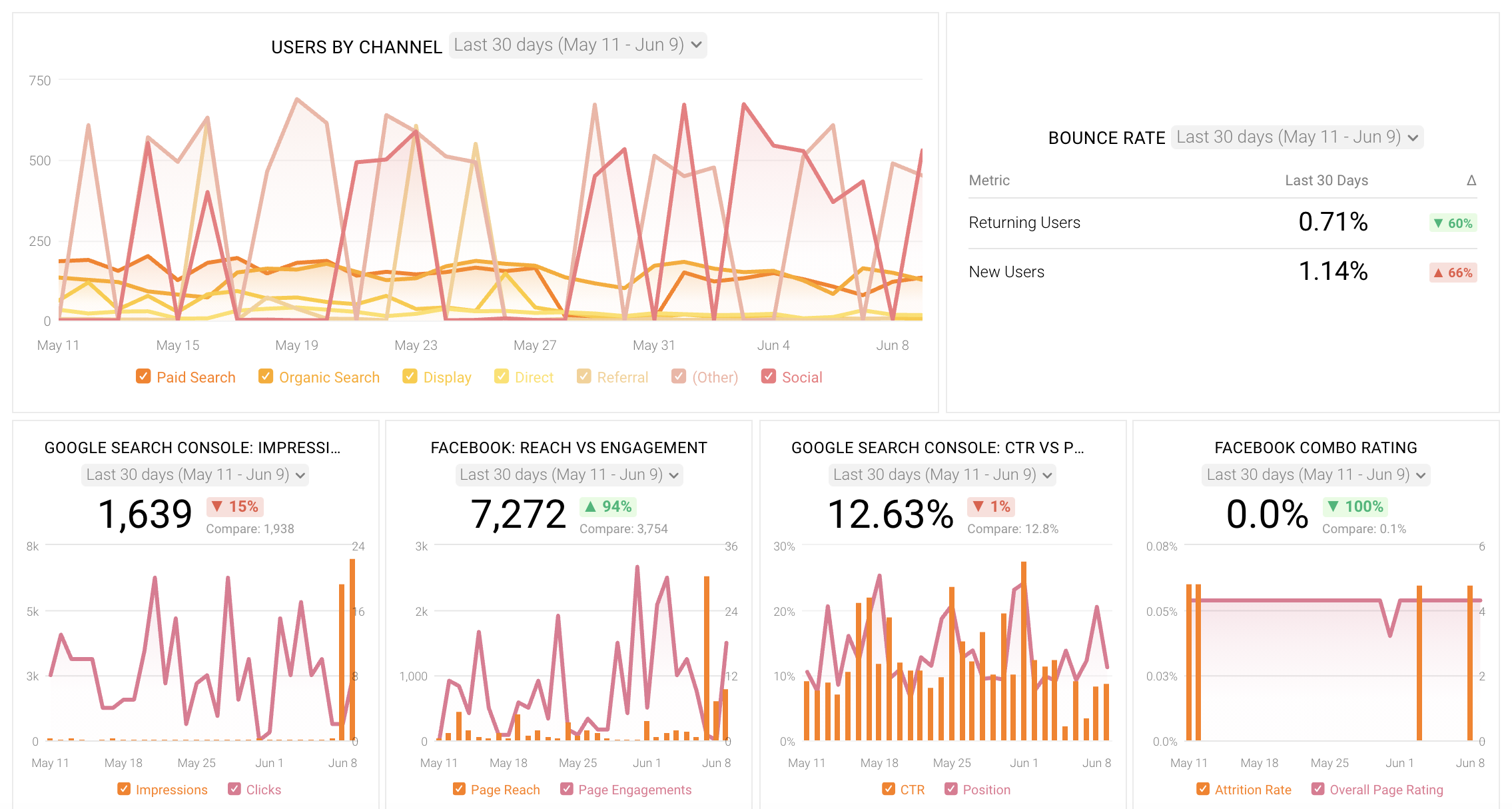
Source: Databox
Visualized Reports
Everyone’s heard the saying, “a picture is worth a thousand words.” If it’s worth 1,000 words, then how many rows of spreadsheets can a picture replace?
If I wanted to show how a particular appeal was performing in relation to the same period from a year prior, historically, I would add in another couple of columns and drop that data into Excel. With Databox, however, I could set up my report to display that performance graphically. A bar graph showing a Q1 appeal comparing data for five years would quickly and more effectively illustrate performance more than the raw data ever could. Trends and anomalies would become obviously apparent.
Automate Your Process
We’ve written about this before, but automating your processes can significantly increase your efficiency. The amount of time spent compiling those master reports was significant—and I was doing them daily, to be able to spot problems quicker. Having an automated process would free up hours per week. What could you do if you suddenly had 8-10 more hours per week?
Integration with HubSpot
Those are some of the benefits of using Databox on its own, but if you’re a HubSpot user (like many of our clients), the built-in integrations make it even easier to use. There’s no need for custom coding or computer development skills. Databox automatically can pull more than 150 different metrics from your HubSpot account, allowing you to build out a dashboard that truly fits your needs.
But Databox doesn’t stop there. Your Databox account can also pull in data from other sources, such as:
- Facebook Ads
- Google Ads
- Google Analytics
- Google Search Console
- SEMRush
By pulling in this external data and matching it with the data in your HubSpot account, you can get a truly accurate picture of the effectiveness of your marketing efforts.
Another benefit of using Databox is that it comes with hundreds of pre-built report templates. Chances are, if you’re looking to report on something, someone else already has, and there’s no need to recreate the wheel. Though I’ve only started digging into the possibilities, some of my favorite templates I’ve come across include:
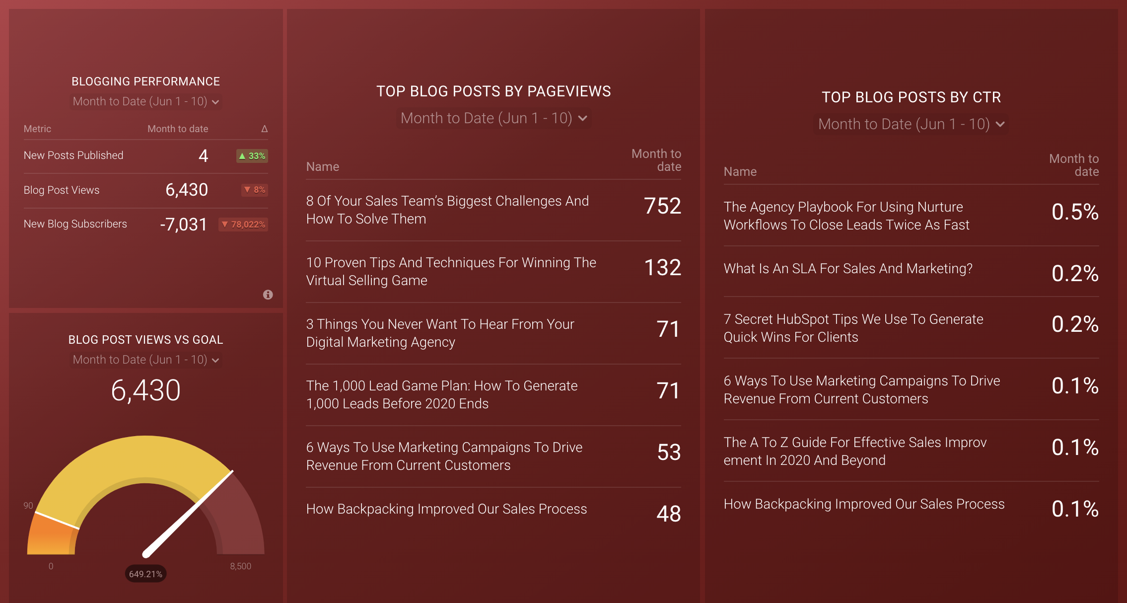
- HubSpot Blogging Performance
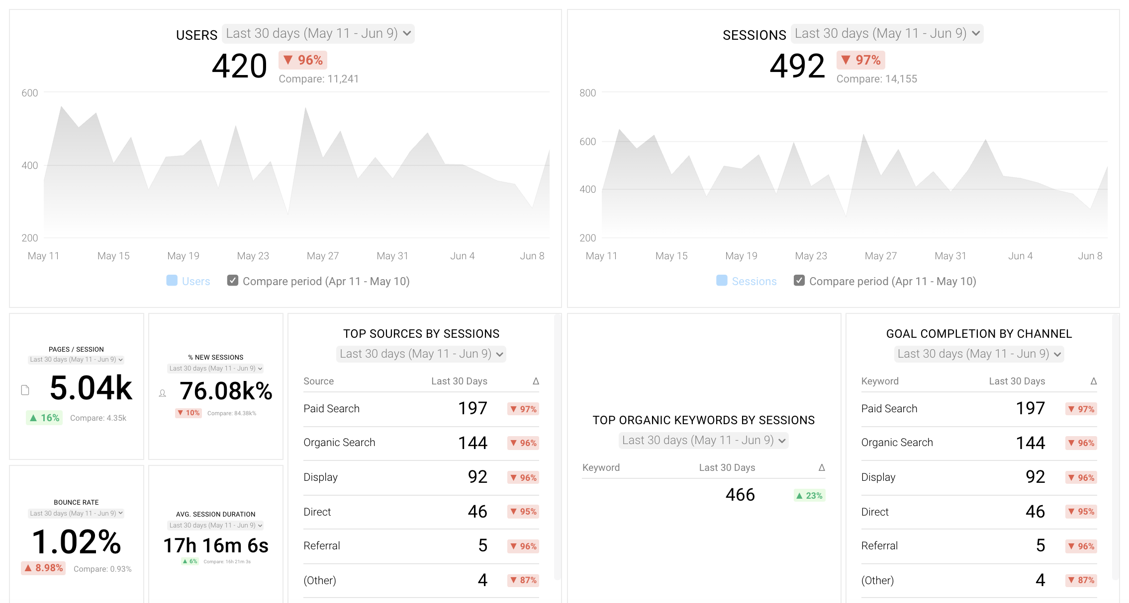
- Google Analytics Website Traffic
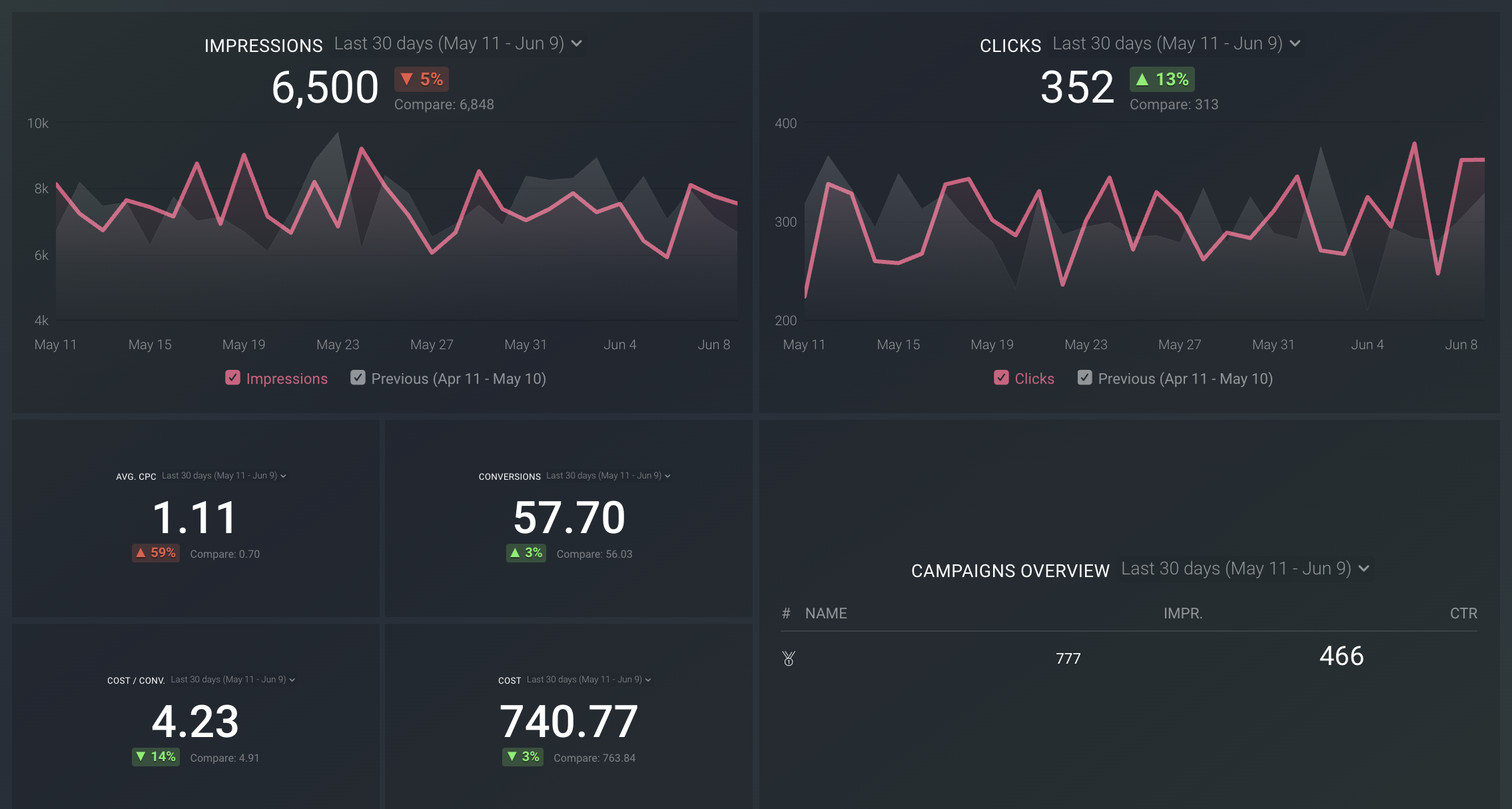
- Google Ads
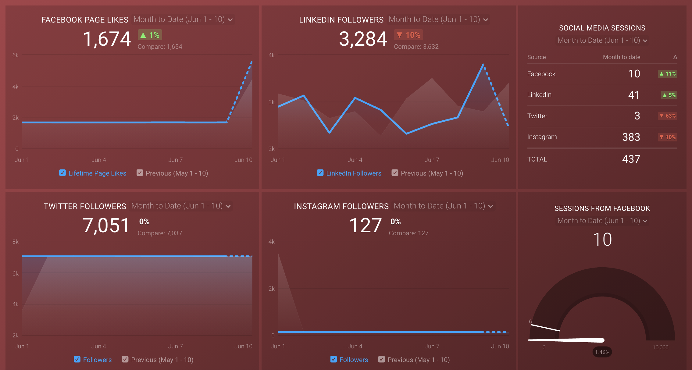
- Social Media Dashboard
- SEO Overview
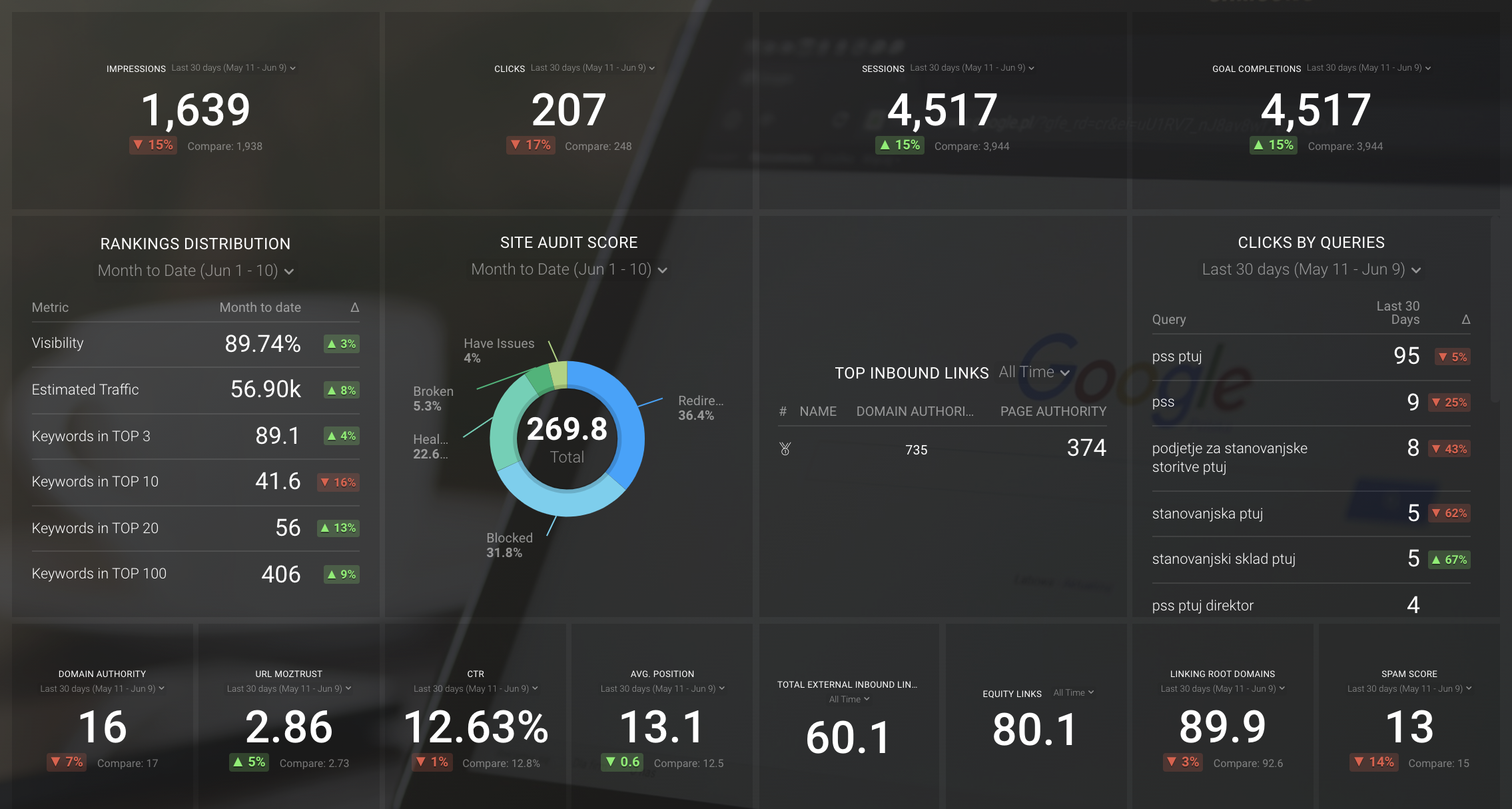
As you can see, Databox can pull in numbers from a wide range of platforms and merge them into an easy-to-read dashboard. As shown above in the Social Media Dashboard and SEO Overview reports, it can even pull in data from multiple sources to the same dashboard. And if you happen to need something truly unique, it’s not difficult to build out a custom report.
Databox can also alert you to both positive and negative trends within your data. This allows you to quickly identify those items that are working to expand on those efforts, and those that aren’t working to pivot before you waste too much time and resources.
So what are you waiting for? Connect with us today to discuss how we can help streamline your reporting process through Databox’s data visualization tools.

%20Logo_BlueOrange_Trademark.png?width=800&height=269&name=Ready%20North%20(RN)%20Logo_BlueOrange_Trademark.png)


.jpg?width=300&name=Services%20Hub%203%20(3).jpg)

